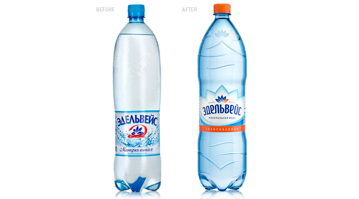


Modernization of the product was dictated by the need to reinforce positions of mineral water “Edelveys” on the Baltic and CIS market. There was a mission to make the product unlike the competitors and also make it dynamic and attractive.
We refined the bottle shape and put some embossments all over the bottle surface. To increase brand awareness our specialists created a logo – a new look at the Edelveys flower.
A complex shape of the label repeats the logo and sets the product apart from other competitors of “quadrate” shape.
Let`s remember how do the shelves with mineral water look like. The designers added orange colour, which is untypical for this sort of product, that “Edelveys” could stand out against the background of faceless blue spot. Moreover, the colour plays an important role in design of juice drinks.
Design quality in this product meets all customer`s expectations, such as dynamic, brightness, activity. In the design these qualities are evident as the original label shape, the bottle shape and the colour itself.