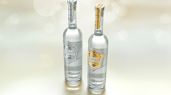


When it was being redesigned, the principal purpose was to make sure the brand name was still easily recognized while customers’ perception of it became more clear-cut.
Initially, the appearance of the product was designed by a famous British studio. Under our project, we created a reserved and minimalistic sequel of the product. The logo was modernized and décor elaborated. The label became more laconic and refined. The new appearance of the product is more noble, meeting the aesthetic ideas of modern consumers. The fact that the sales of the White Gold vodka are on the rise confirms that its new image assures its correct positioning and recognizability.