
The producer set us a super mission to remake recently well-known alcohol brand. He challenged us to renew brand image and make it even more popular without any extra expenses. The most limiting factor was to leave previous bottle shape.
The Gzhelka used to be well-recognizable brand with variety of Russian and international awards. It should be reintroduced in market in the best way but keep its authenticity.
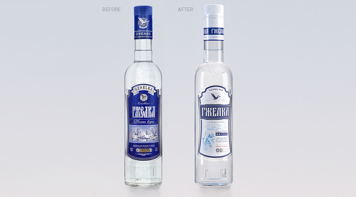
The new image design solves all these tasks completely. The main decision was to make adjustments to the color scheme and move from dark color value to bright colors. This sort of color combination is more distinctive to this brand image.
Also we designed the original corporate logo. It is important to mention that Gzhelka haven’t had the logo before. The new brand logo is appealing to target audience and fix attention on the name of the product. Moreover we added some unique illustration to