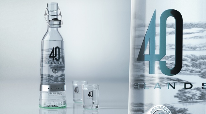
While redesigning the appearance of the 40 Islands vodka, we wanted to emphasize and amplify the impression of the transparency and purity of the product. In the new design, we successfully achieved that by using an illustration, a simple logo and the minimal area of the label. The illustration conveys the feeling of a misty morning on a lake, while the simple and austere shape gives the product more style and makes it more modern.


